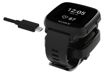
The wrist is a very sensitive part of the body. We all know how irritating a slightly uncomfortable wearable device can be. But it is emotionally sensitive, too, because what we wear on our wrist matters to us.
It can reflect our status, our tastes. In fact, our whole self-image. If worn by an athlete, a chunky wearable might suggest commitment and effort. On an outdoor adventurer, it might indicate the urge to explore. But when used to monitor chronic health conditions, for example, wearables may signal something we prefer to keep quiet. Here, the ideal device is as unobtrusive as possible.
An experienced team
Thomas Waldner, Director of the Sony Design Center Europe, Nordic, led the mSafety design team. Its key members already had several smart watches from Sony and Sony Ericsson in their portfolios, so they had plenty of experience to draw on. “We already knew about ergonomics and were familiar with population-wide data on different wrist sizes,” says Thomas. “This enabled us to achieve a shape, size and width that would suit as many types of users as possible.”
Defining the size
“Our stakeholders always want us to make wearables smaller, but there are also good reasons for making them bigger,” says Thomas. “For example, it’s good to have a long battery life, but higher capacity batteries naturally impact device size,” says Thomas. “People may also want large buttons to make handling easier, or a larger display to compensate for poor eyesight.”
The broad experience of the product and engineering team also proved invaluable when looking ahead to volume production. “They were fully aware of the issues that can arise when manufacturing at scale. If you make the wrong decision early on, problems can get built into the design,” says Thomas.
Display is vital to users
Designing the mSafety display presented several demands with use case scenarios ranging from healthcare to hazardous workplaces. “We based the display on an interface that was tested in the diabetes use case. That is one of the more demanding applications, so we were confident that it would work in many other situations, too.” To accommodate all scenarios, the team incorporated both touch and button functionality for user-interaction with the device.
Design of the band
Another interesting and commercially important aspect of the design was the watch strap. “We knew it could be made in one of two ways: either connected to the device with pins or integrated in a single piece of material. The integrated option is aesthetically pleasing, but technically more difficult,” explains Thomas.
In the end, the team chose the pin option for two main reasons: “It makes the band easier to repair or replace, and it gives our B2B customers the opportunity to apply their own brand or later rebrand it if they wish – without requiring us to change our packaging, production or logistics.”
Choice of charging solution

Charging also had to be taken into consideration. “Whatever method we chose had to be efficient, reliable and easy for all kinds of people to use,” says Thomas. The team knew USB connectors are easily obstructed by dirt and dust, and that the more reliable USB-C would take up too much space on the device.
“That’s why, from the outset, we pushed for charging pads on the bottom of the device, and a corresponding charging puck with a magnetic catch. That solution has already been proven in practice, so we were confident our manufacturers could handle it. The advantage for our intended market is that this solution is so easy to use, even for the elderly or people with no mobile tech experience. All they have to do is pop the device onto the charger. They don’t even have to look at what they’re doing.”
The move into three dimensions
“Once all these decisions were made, we could start work on the device itself,” says Thomas. “We made a CAD model with a PC board, display, and all the components. Then we used this to tweak the stack-up with the engineers, going through several iterations until we agreed on the details of mSafety’s shape and design.”
“At this point, we could see what both the outside and the inside of the wearable would look like. So, we produced a 3D model to demonstrate the size and fit to our stakeholders and get their feedback. We also made renderings of the product in various contexts to help bring the product to life.”
The result
Thomas and the team are satisfied with the results of their two-year project: a relatively small wearable with an optimised battery life. A device that is reassuringly solid yet unobtrusive, and suitable for a wide range of partners and end users.”
However, he is also keen to point out that the device is only one part of the total mSafety package. The whole solution embraces the platform, the IoT infrastructure and the connectivity: “It’s like an ice berg and the wearable is the visible part above the water line. But there is a whole lot more ice beneath the surface!”

Are you considering entering the market for remote monitoring with a wearable device? Our ‘Make or buy briefing’ contains a useful checklist of the things you need to think about. Get it here.
Would you like to learn more about mSafety and how your business can leverage the remote monitoring solution? Contact us here.